Logo. Full version
The CAPSBOLD logo is the main element of the company's corporate identity.
The main CAPSBOLD logo contains the CREATIVE MARKETING AGENCY descriptor and is a priority for use.
All proportions of the logo are fixed and cannot be changed.
The logo must be used only from original materials.
Logo. Short version
A short version of the CAPS BOLD logo is a sign without a descriptor.
This logo is used on small-sized media, if it is impossible to place
the basic logo with a descriptor, also in SMM and souvenir products.
Safezone
To ensure the correct display of the logo, it is necessary to take into account the minimum size of the safe zone. There should be no graphic elements
or text in the area of the safe zone.


Minimum size
The version of the logo with a descriptor is the main and priority for use.
Logo with a descriptor
The minimum size of the logo for printing is 27.5 x 10 mm The minimum logo size for digital is 140x51 px
The option without a descriptor is used for souvenirs, in social networks and in cases
when the descriptor becomes too small, which impairs readability.
Logo without a descriptor
The minimum size of the logo for printing is 10x10 mm The minimum logo size for digital is 50x50 px
LOGO COLOR SOLUTIONS
On color media, the logo can be branded purple or white.
The main condition that must be observed when using the sign is contrast.
CMYK 80 90 0 0 Pantone 2097 С RGB 105 35 194 HEX #6923c2
CMYK 0 0 0 0 Pantone 000 С RGB 255 255 255 HEX #ffffff
Monochrome use of the logo
When placed on monochrome fills with a density
of up to 30% black,
the logo is applied in black
When placed on monochrome fills with a density
of up to 30% black,
the logo is applied in white
Using the logo on photo images
The logo is completely on the light element
The logo is on a acceptable background
The logo is completely on the dark element
The logo is located in the selected composition, without going
to the detailed elements
Unacceptable use of the logo

It is forbidden to change the font in the logo

It is forbidden to transform individual elements of the logo

It is forbidden to change the composition of the logo

Disproportionate transformation
of the logo is prohibited
It is forbidden to use colors that
are not provided
It is forbidden to use a gradient
in the logo
It is forbidden to use effects

It is forbidden to place the logo
at an angle
Unacceptable use of the logo on photo images
Low contrast between the logo in color and the background
Too active and detailed photo on the background
Low contrast between the logo in color and the background
The logo goes to the significant areas of the image
Sign and colors. Contrast of logo and background
Acceptable contrast
Insufficient contrast
Acceptable contrast
Light background
Dark background
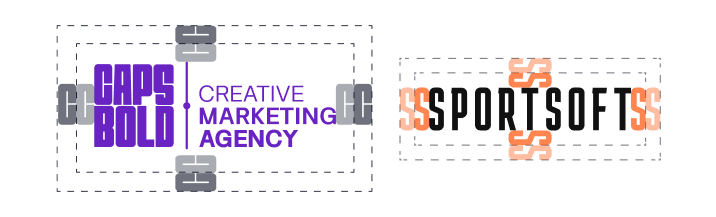
Co-branding
When creating a co-branded logo for CapsBold and Sportsoft, both logos must be visually equal in size. The extended version of the CapsBold logo is not allowed, as the significant difference in character count makes it impossible to achieve visual balance between the two logos. Additionally, the separator between the descriptor and the name in the CapsBold logo creates the impression of a «triple» co-brand, which is unacceptable — only two logos may appear in the collaboration.
Examples of co-branded logos in color are provided. The horizontal version is considered the primary one. The vertical version should only be used when the horizontal format is not an option.


Co-branding rules
If the extended version of the CapsBold logo must be used, the collaboration symbol should not be included. The logos should be placed in a single line, with clear space maintained around them. This ensures clarity and improves the readability of both logos.

Branded safe zone for the logo
If it is necessary to place the logo on a controversial background (having an average tonality or photos with increased detail), a branded safe zone is used. It can be a basic purple color with 85% color transparency or a corporate black color with 75% transparency, while the logo on the safe zone is 100% color fill.
Colors
Full version of the logo with a branded safe zone
A short version of the logo with a branded safe zone
CMYK 80 90 00 00 Pantone 2097 С RGB 105 35 194 HEX #6923c2
Opacity 85%
CMYK 85 84 48 60 Pantone 276 С RGB 20 24 41 HEX #141829
Opacity 75%
Using a logo with a safe zone in a photo with
a detailed background
favicon
The favicon represents the first letters of the company name, C and B.
It is used as a site tab icon in the browser.
Favicon attracts the attention of users, helps to make
the site more recognizable:
it can be seen in browser tabs, bookmarks, on the smartphone screen.
